London Homicide
This was my CPSC 583 group project. We had to create a data visualisation utilising the javascript library D3.js. My group found data on homicides in London throughout the years and decided to use that for our visualisation. We combined the usage of map and charts to display the information. I received an A- for the project.
Investigation
First we had to discover what dataset we were going to visualise. We went on various websites such as kaggle.com, statista.com and good old fashioned Google. There were four that we were interested in; fast food restaurants, homicides in London, unemployment rate and employment rate by educational attainment, and periodic table of elements mapped to stocks. The decision to use the Homicides in London dataset came because of the ability of visualising it in multiple ways as well as being able to draw multiple stories from it.
Design
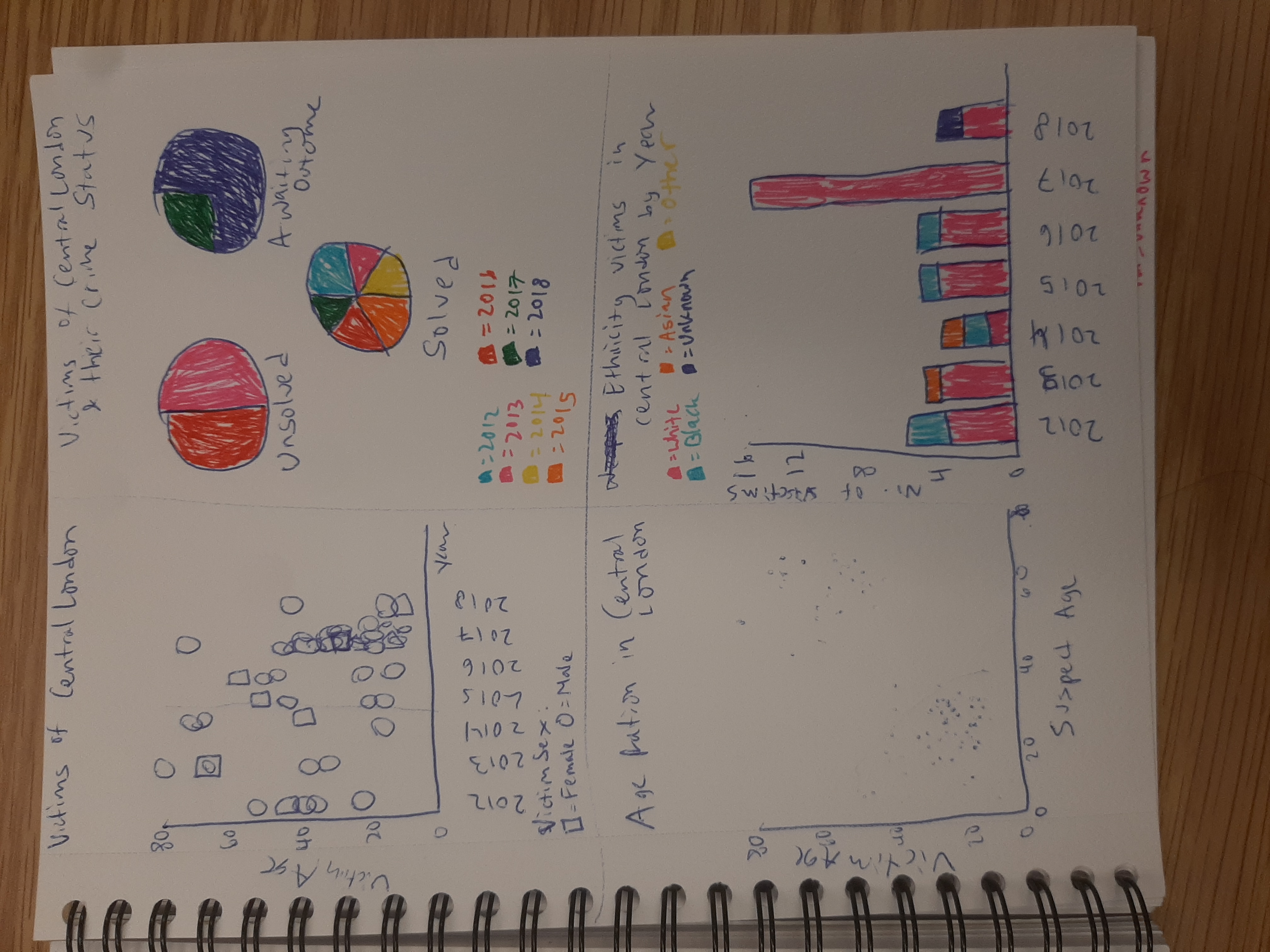
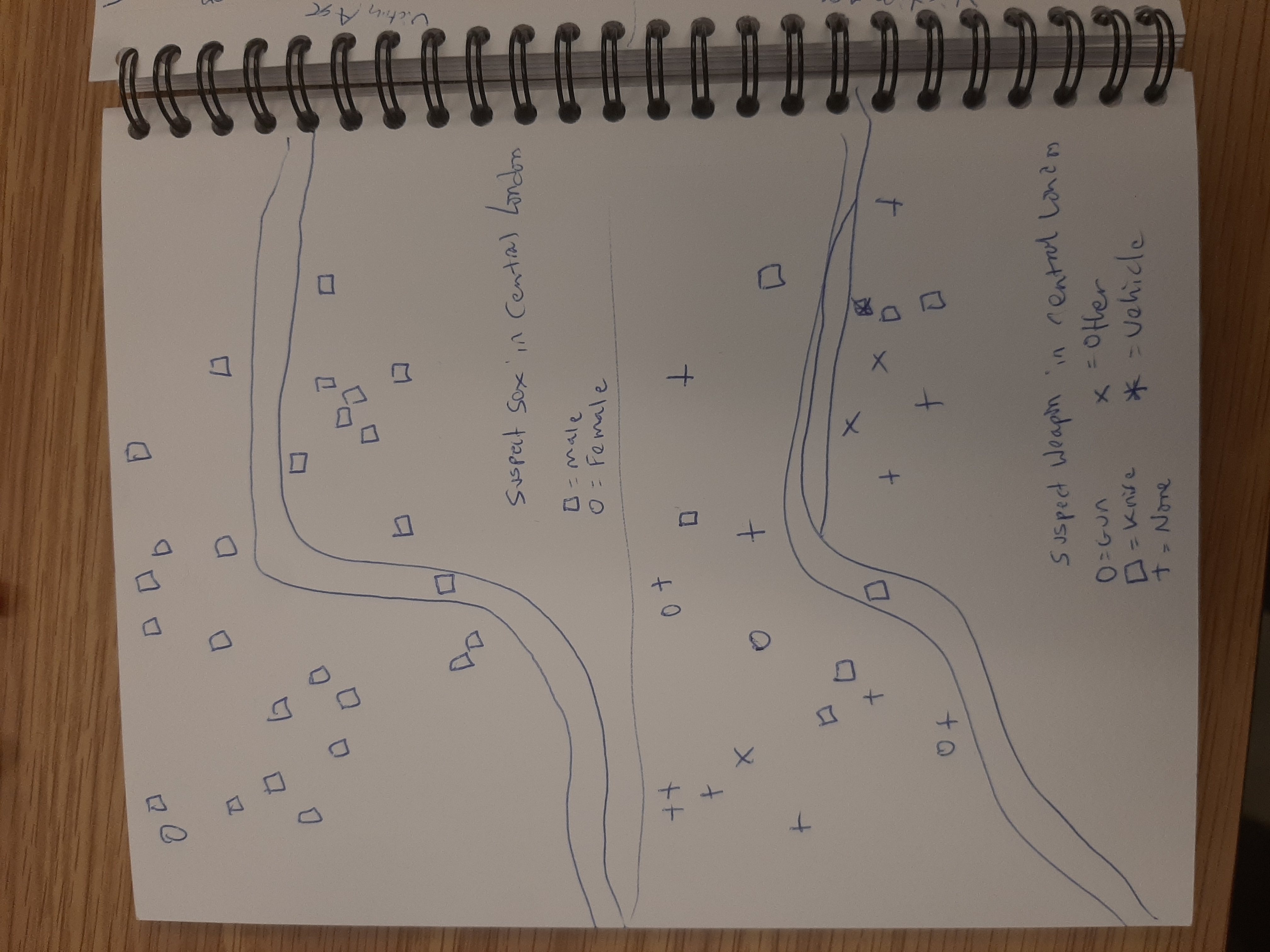
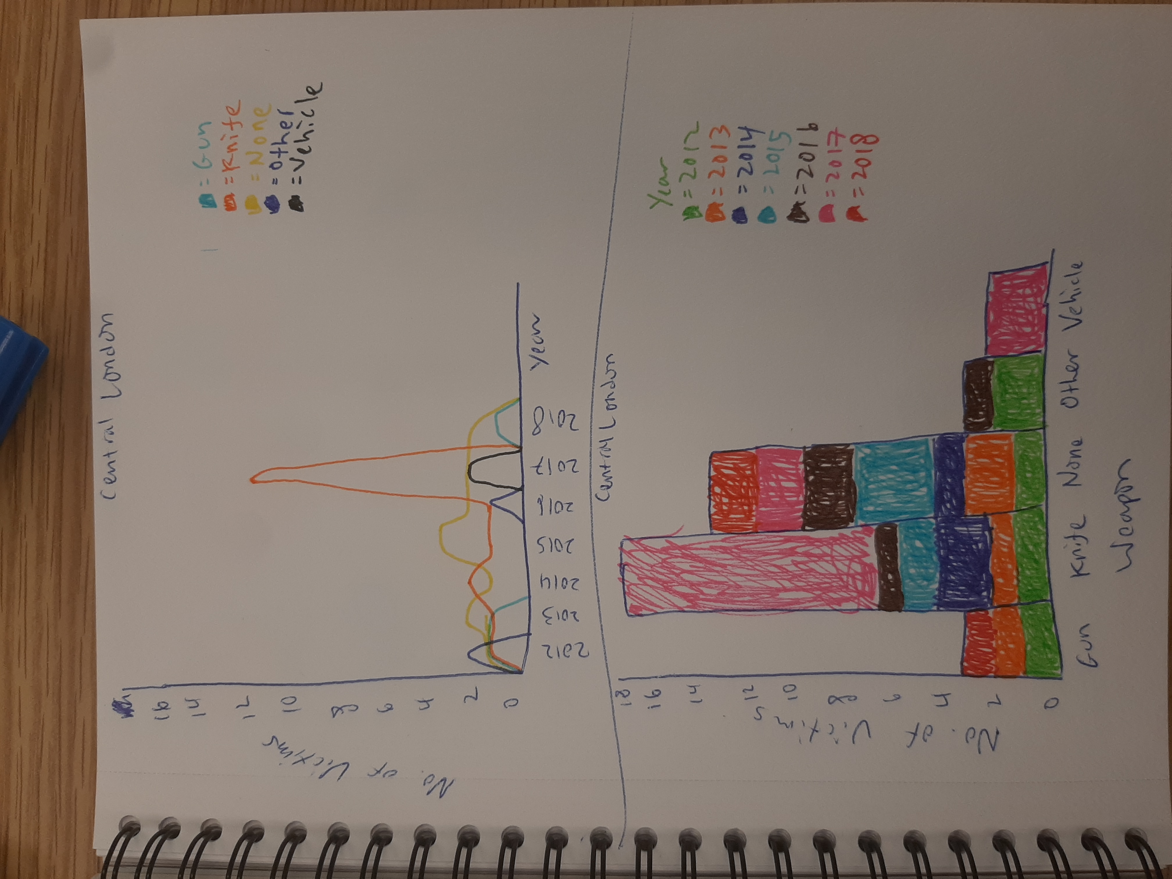
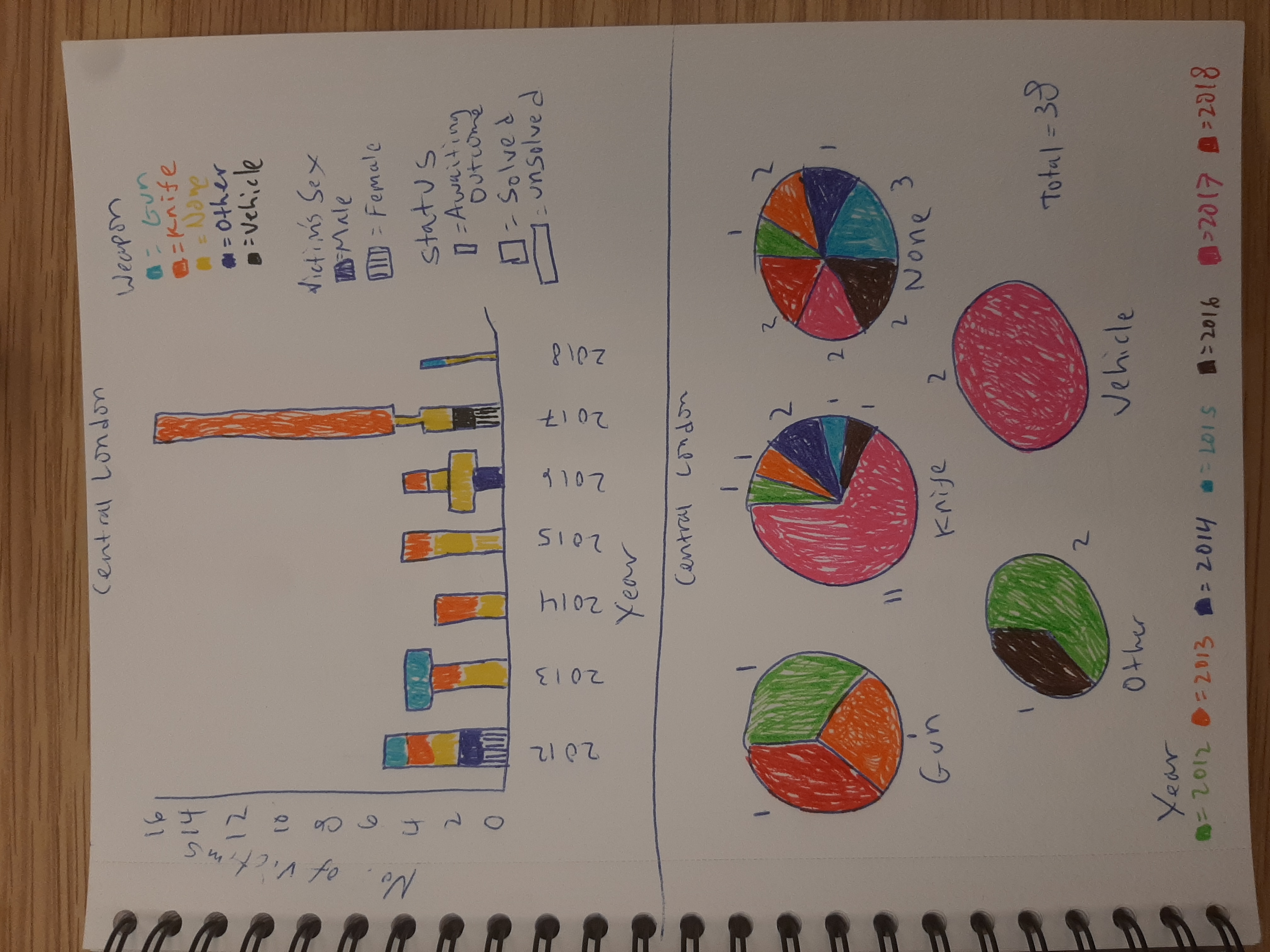
Utilising the 10+10 method, we came up with 40 sketches with visualisation of the dataset. We then created variations of such sketches to further explore the visualisation possibilities. After that, we prototyped 10 variations in D3.js. We had to decide on which methods to implement, we left out features such as the size of the icon as it was hard to distinguish on the map.
Implementation
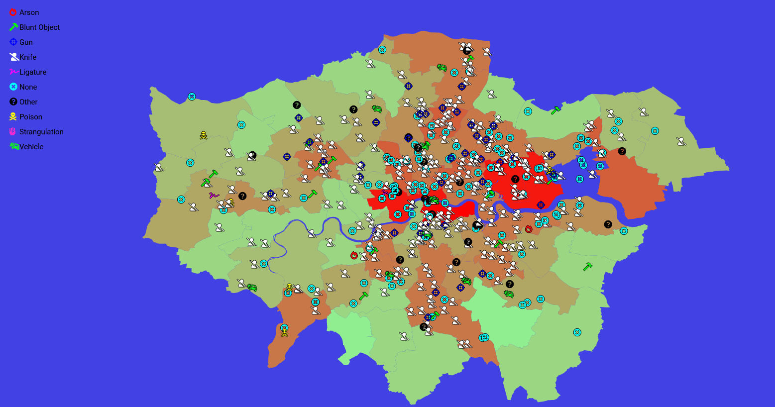
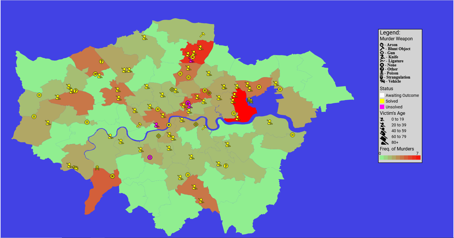
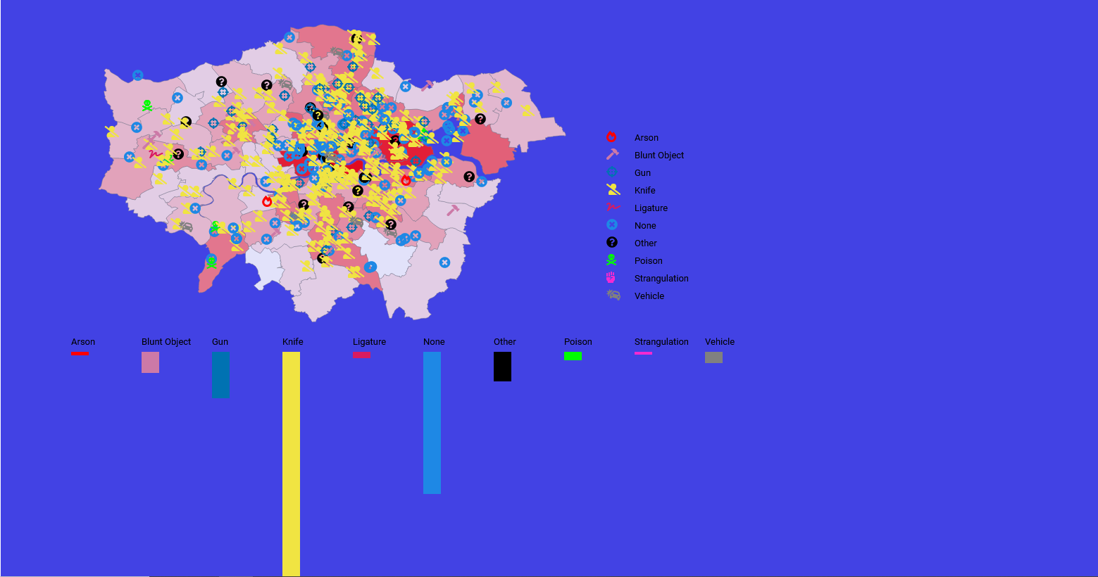
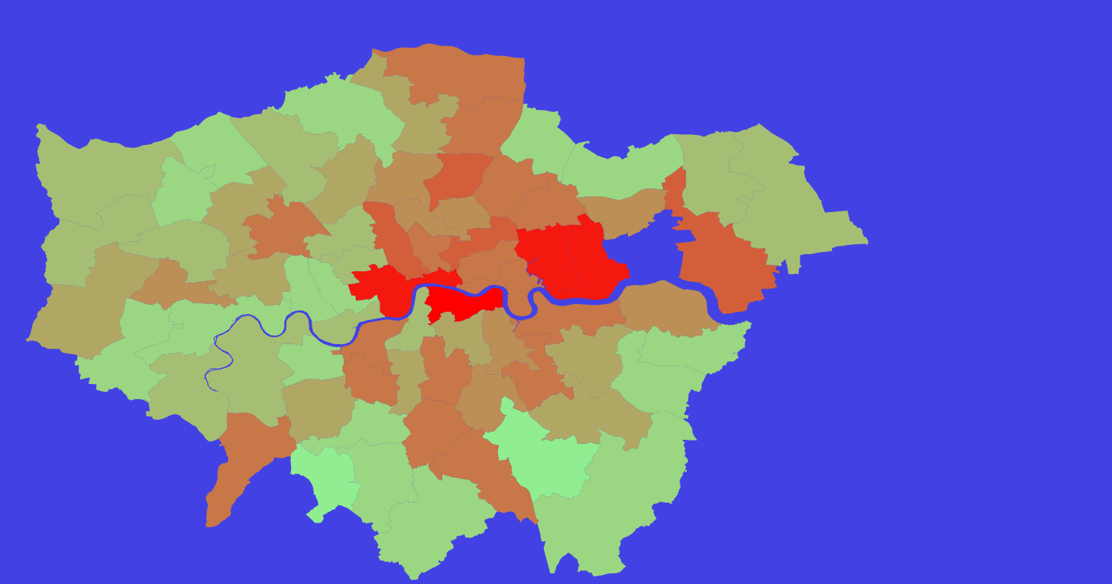
Using d3.js, we created a map visualisation to represent the data. There are quite a few stories that could be told since we used various techniques such as colour, using icons and interactivity. There is a slider to change the year for the data and further filtering can be applied by clicking on the bar chart. The map, icons and bars are hoverable to provide further information. The data is also categorised by murder weapon, the sex of victim, the sex of suspect as well as the location.
Evaluation
One thing that we could have done is implement charts such as a pie chart that is connected to the map and bar charts which could portray more data such as the age ranges of the victim, since there is still a lot of space available to be used on the page. The visualisation also has a dated feeling and we could have improved upon this with our colour choice and format of the visual elements.